News
I know what you’re thinking when you see anything marketing-related with “AI” in the title, but hear me out. I’ve seen this first hand and…yeah…it’s really, really cool.
Our ability to import, make sense of, and build marketing on top of season pass usage / scan data has always been a popular feature among Inntopia Marketing Cloud users. So when we built our new Pass Scan Detail report, we didn’t hold back.
Here’s a quick tour.
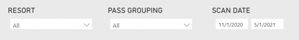
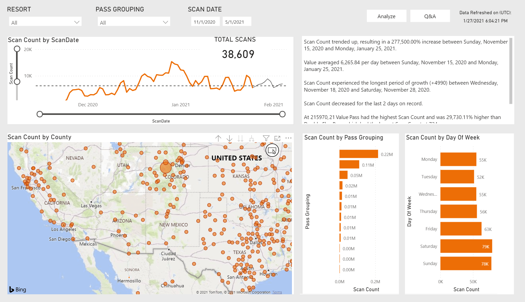
At the top you’ll notice a set of simple controls you can use to change what the dashboard tells you. If you have multiple resorts you can filter by individual locations, pass groupings will allow you to view data only for a specific type of pass (Gold, Midweek, 5-Pack, etc.), and scan date sets the range for which scans should be analyzed.
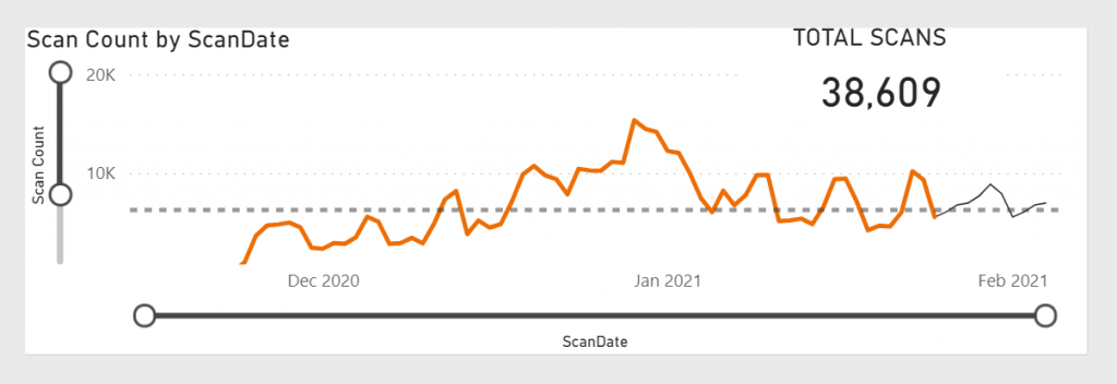
Next is a simple graph that lets you explore the trends in scans over time as well as see a total scan count for the date range you chose. Note that the sliders on the X-axis and Y-axis let you quickly drill down into these ranges on the fly. And notice that the chart will also forecast scans beyond today’s date which is indicated with the gray line on the right side of the chart.
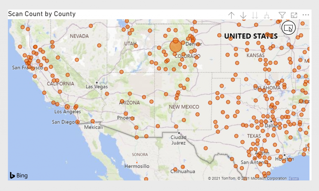
Next, you’re able to view scan totals by the county from which those guests are based. You can zoom out or in as much as you’d like to explore trends and visitation numbers.
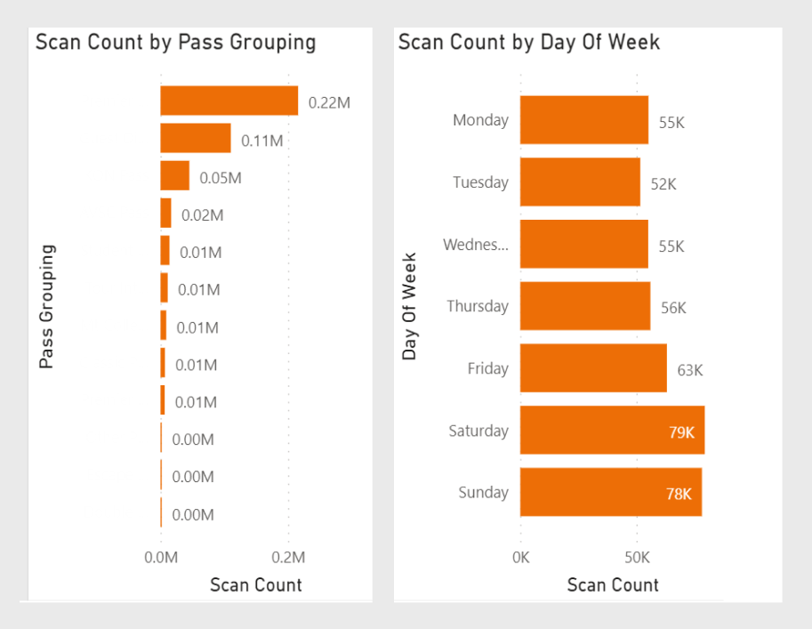
Next, we break out scan counts for this range by two default areas: scan counts by pass grouping and scan counts by day of week. Keep in mind, these are interactive. So if you click on, say, the “Thursday” bar in that second chart, the rest of the dashboard would adjust to only show trends for folks who visited on Thursday. And if you hold “CTRL” while you do this you can filter the dashboard by multiples data-points at once.
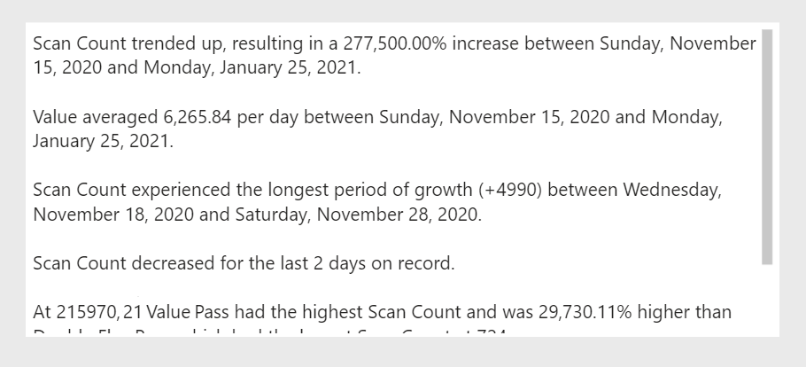
This is where it really gets cool. Because instead of the dashboard doesn’t just break down the data into simple visualizations, it actually finds the key stories within your data and displays them in plain English sentences. Again, I’ve seen this in action and it’s incredible to see how accurate an insightful these are. While these insights are based on demo data, you can see the kind of stuff it’s able to identify.
So there you have it. A brand new report full of incredibly insights. With a hint of AI that actually delivers something tangible and doesn’t leave you wishing you’d never hear that acronym again.
Want a quick tour? Just reach out, we’d love to show you around and answer any questions you have.