News
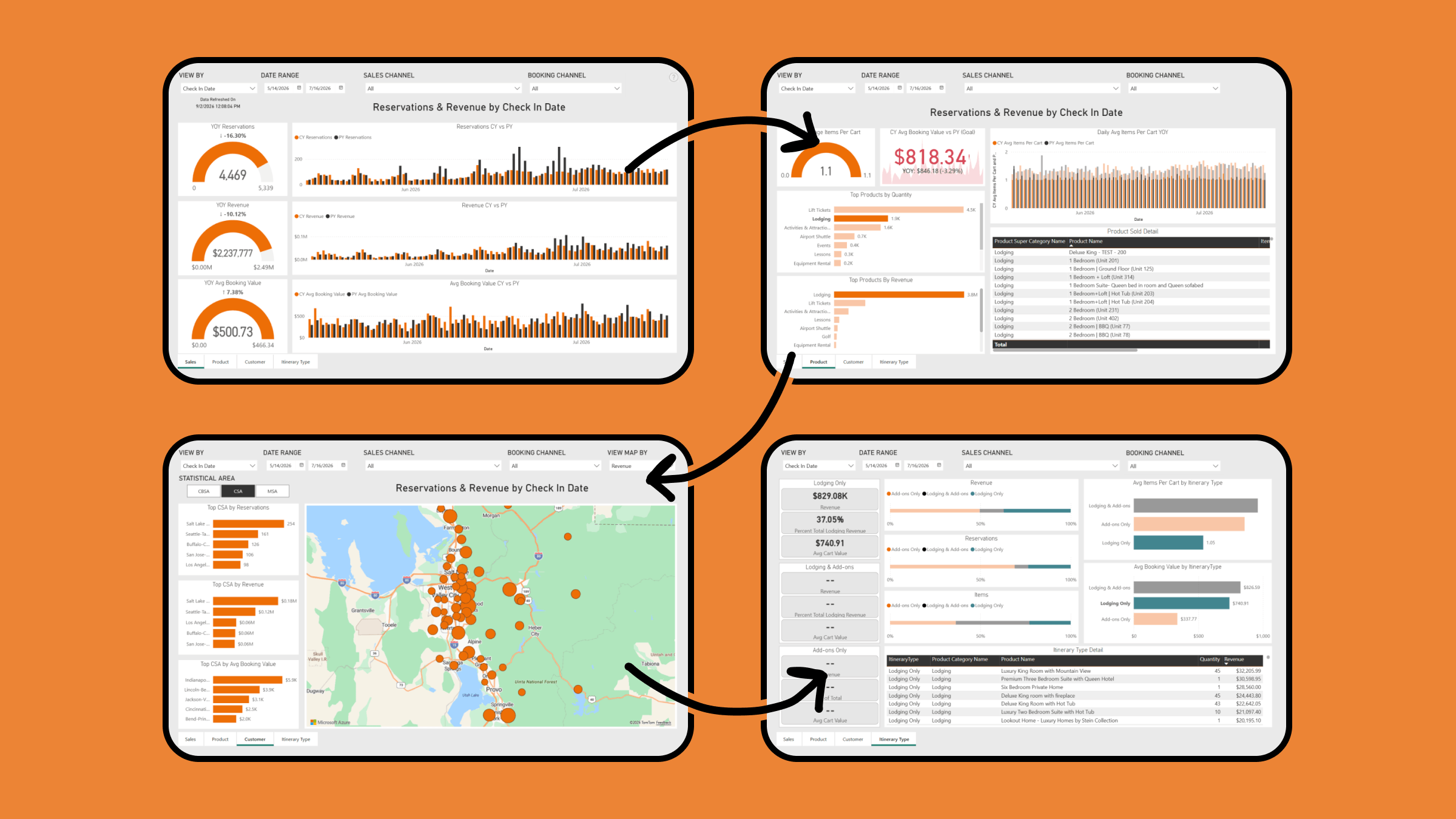
Commerce Dashboard is the hub for analyzing the performance of everything you sell through Inntopia. This feature isn’t new, but our Business Intelligence team has been hard at work making this report even more useful, insightful, and actionable. Every Inntopia Commerce user has access to this new functionality, so let’s quickly walk through each of the four key views of this powerful tool.
The Sales tab gives you a day-by-day view of reservations and revenue, by either check in date or reservation date. Each chart and graph also includes a year-over-year comparison with current year in orange and previous year in black. Half donut charts have this year’s performance in the center, last year’s performance on the right side, with the chart representing the difference between the two.
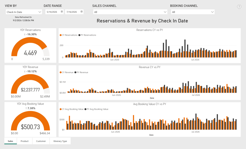
Dates can be set to look backward to view past performance or forward to analyze pacing. If you use multiple sales channels within Inntopia, you can also toggle these on and off to view all, some, or just individual channel performance. Finally, you can toggle between online or call center bookings using the Booking Channel dropdown.
The Product tab enables you to view the performance of your booking engine and call center on a product-by-product level. Another half donut chart provides a view of average items per itinerary and a chart showing this value over time. The average booking value is shown between these charts. Red indicates this number is up YOY with green indicating down.
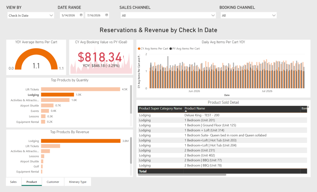
Additionally, you can see top products sold in terms of both quantity and revenue. Notice in the screenshot above that one bar is brighter than the rest. Click any bar to filter this entire view solely by intineraries containing this product type. Click it again to toggle it off.
On the Customer tab you can visualize your sales geographically using an interactive map. You’ll also notice a new control in the top nav allowing you to toggle between revenue, reservations, and average booking value for this visualization. You can also toggle between CBSA, CSA, and MSA depending on your preferred method of grouping your markets.
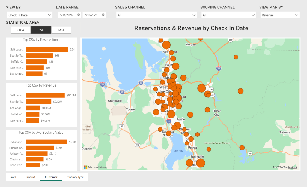
As with the previous screen, you can click on any bar to filter the results and map by just that statistical area.
Finally, on the last tab, you’ll be able to explore the performance of various itineraries by type: lodging only, activities only, or lodging and activities. Each group of itineraries includes metrics for total revenue , percentage of total revenue, and average cart value.
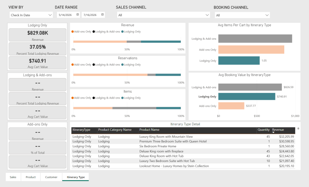
Just like the previous screens, you can toggle the entire chart and data table by clicking on any bar chart. In the screenshot above, we’ve filtered the results by lodging only itineraries.
As you hover over various sections and charts, you’ll notice even more controls over the data within Commerce Dashboard. These will show up in the top right of charts, graphs, and data tables.
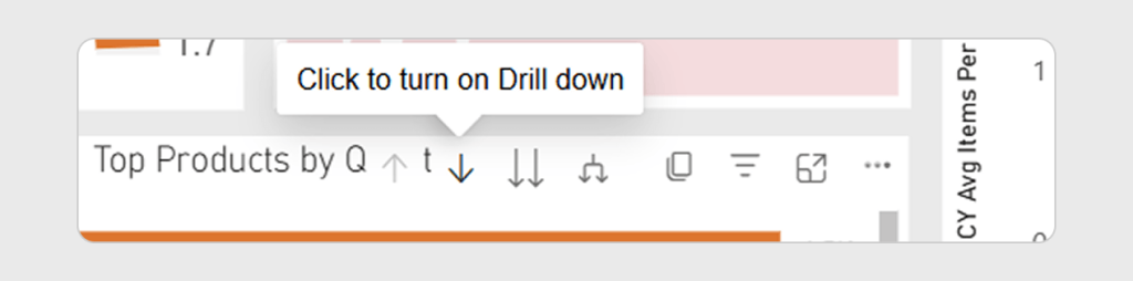
A few common ones you may want to try include:
Again, every Commerce user has access to this tool so sign in, dig in to your data, explore the different views, toggle on all the features, and I think you’ll be just as excited as we are about the insights you’ll unlock about your products, guests, and performance with this latest update to Commerce Dashboard.