Trends
In nearly every discussion around responsive email design, a common statistic is shared: if your message “doesn’t look good” on mobile, 80% of people will delete it. With more and more marketers basing marketing and template design decisions on this statistic, we wanted to see how many email users were actually doing what they said they would. Here’s what we found.
The Goods
This 80% statistic has two pieces: the likelihood that an email “doesn’t look good” and the likelihood of acting on an email that “doesn’t look good.”
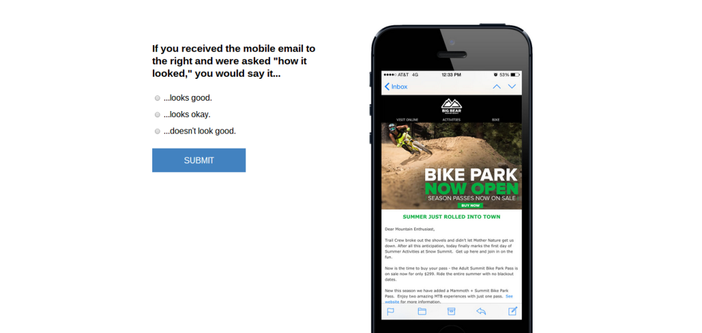
Without knowing the first part, we can’t answer the second. So, to find our answer we started by having 15 of our clients’ email templates (7 random responsive, 7 random non-responsive, and 1 control intentionally made to look bad) rated as “looks good”, “looks okay”, or, to use the same phrase as the original survey, “doesn’t look good” by 410 random internet users from the U.S. and Canada.

(screenshot of survey)
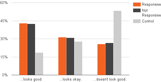
Each participant was randomly shown one template at a time. These participants, on average, rated just over 3 templates each for a total of 1,268 responses. Here’s what we found:

Interestingly, we saw very little difference between responsive and non-responsive templates in terms of rating. More specifically, the responsive templates in our sample were rated as “doesn’t look good” 25.7% of the time versus 26.6% for the non-responsive templates. As expected, our control was half as likely to be labeled as “good” and twice as likely to be rated as the opposite.
What This Means
We honestly didn’t expect this. The non-responsive templates had smaller font sizes and smaller links which could impact usability, but purely in terms of “not looking good” on mobile devices, there appears to be almost no difference between the template types. So, takeaway #1 from our sample:
Responsive emails were just as likely as non-responsive emails to be rated as “doesn’t look good” on mobile. (tweet this)
But remember, the point of this wasn’t just the ratings themselves but to then see if 80% of those people actually delete the email. As you guessed, we’ll cover that next week in Part 2.